
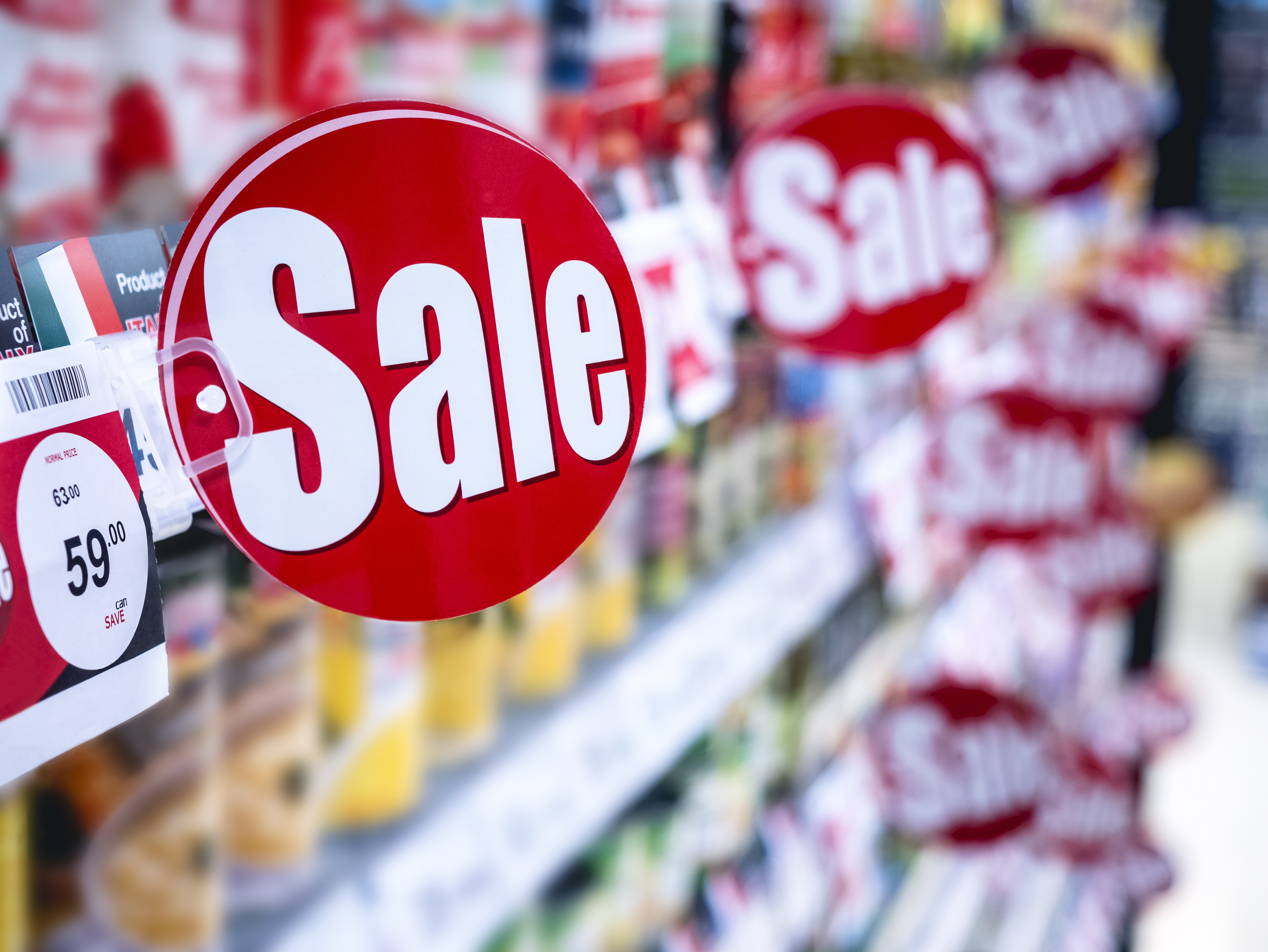
Did you know that consumers make more than half of their purchasing decisions in-store? This is why point-of-purchase (POP) marketing is so important. One classic but not yet cliché way to grab your customers’ attention while they’re shopping is through the use of print signs, such as shelf talkers, wobblers, and flags. They’re all pretty similar but differ in shape and the way they adhere to a surface. Wobblers have actually been known to boost sales up to 33% according to Xeikon.
POP signs are most often used to help a specific product stand out from its competition. However, they can also be used to announce new flavor options, boast awards, highlight nutritional benefits, draw attention to a sale, and more! Long story short, these signs may be small, but they have a big job to do!
That being said, if you use shelf talkers and other POP signs in your store it’s important to make sure that they’re as helpful as possible. A great way to do this is by insisting on good design. Here are some things you should consider before creating your next shelf talker...
- Message
The first step is to decide what you’re trying to say with your POP sign and who you’re trying to say it to. A key aspect of good marketing is determining your target audience before running a campaign and then creating content that speaks directly to this audience. If what you say with your sign doesn’t attract the people that you’d like it to, then it’s a wasted effort.
Another thing to consider when deciding on your messaging is that this sign will essentially serve as the voice of your product. So, there’s no need to repeat any information that’s already on the packaging or somewhere else nearby. Instead, think of your shelf talker as a miniature, on the spot sales pitch. You want to quickly grab your audience’s attention. No need to spill all the details right then and there.
- Words
When it comes to POP signs, you don’t get a lot of real estate so make every word count. Plus, customers should not have to come closer to the display to see what’s written. In fact, most customers won’t be willing to, which means your carefully crafted message will be altogether ignored. So, keep your words short and sweet.
The text should be considered to be part of the overall design. This is especially true when it comes to choosing a font, which can be a very helpful tool in regard to readability. Whatever you choose, definitely go for a big typeface.
You could also think of the text on your sign as a title or headline, meaning all of the most important information is presented in a simple, clear, and to-the-point manner. Don’t overload customers with information. Do use buzzwords like “sugar free” and “50% more.”
- Colors
It’s traditional to use vibrant colors on POP signs to grab attention. A common color combination found on shelf talkers is red, black and white because it allows for the best contrast when it comes to reading text. However, we don’t always recommend sticking with these classic choices. Of course, the colors in your design should both attract attention and make your sign easy to read but think outside the box!
Unexpected colors could be just what your product needs to stand out. You could go with using exclusively your main brand colors in your sign design. This could actually be turned into a cohesive signage theme throughout the entire store, which would make not only your signs attractive but would actually boost the appearance of your entire space.
- Graphics
Just because you need to get people’s attention doesn’t give you an excuse to be cheesy. Stylish and modern graphics will actually attract more people anyway. It can help to first pick out which product you’re trying to market and then use it as the inspiration for your graphic design. This will help your signs stand out because they will all be slightly different from each other. If all of your signs look too similar, then customers will start skimming over them. This means they will totally miss all the messaging you worked so hard on, which should actually be the primary focus of the signs. Overall, graphics should highlight the text, not distract from it.
Once your POP signs are all designed, it’s up to you to use them wisely. Place them sparingly and strategically in order to draw attention to specific products that you’re trying to sell quickly. Plus, you should switch them out often so that customers don’t get bored. Sometimes the world can seem like a sea of advertisements, but with smart graphic design you can still stand out. Finally, shelf talkers and other POP signs are an investment because they will result in sales, so don’t be afraid to spend money on professional designers and commercial printers.


Leave a Reply