How Print Design Can Help Your Direct Mail Stand Out
In the digital age, we’re bombarded by statistics trying to tell us that paper is a dying medium. Everything from books, to newspapers, to mail have turned electronic. Take this stat for example…
According to the USPS, total mail volume has declined by 29.85% since 2006.
Words with negative connotations like “declined” make us think that marketers aren’t using direct mail anymore because it’s no longer effective. But there is more evidence out there to prove that this is not the case!
The average response rates for direct mail in the United States are 9% for house lists (a 173% increase since 2006) and 5% for prospect lists (a 194% increase since 2006).
When properly analyzed, what the current stats actually show us is that direct mail marketing campaigns are more effective than they have been in years and this is because of, not in spite of, the fact that less individual pieces are being sent out. Since this method of communication is less common now, pieces of direct mail grab the recipient’s attention right away just by being one of the few things that showed up in their mailbox that week. People are used to being hit with online marketing messages all day long and these can turn into a blur after a certain amount of scrolling. But holding a physical piece of mail in your hand? That’s a different experience.
Physical, tangible, tactile messages grab more attention and leave a longer lasting impression. What’s even more exciting for marketers is the design elements that can be added to your pieces of printed direct mail and will help your company stand out in a crowd. When it comes to print design, every choice is a conscious one, from paper and ink colors to photography and typography. Even the overall layout, how something gets folded, and the specific stock choice can affect how a recipient feels about the final piece of mail.
Carefully considering each aspect of your print design and adding unique embellishments to your projects will show people that your company values professional, top quality work and attention to detail. Although some embellishment techniques have been around for quite a while, and most people that work with print design know about them, there are plenty of new ways to modernize and utilize them. Keep reading for a few examples…
Die Cuts

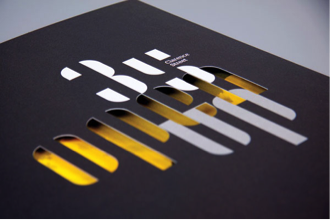
Die cutting is the process commercial printers use to create interesting edges on paper, perforate areas that can be popped out later, or even fully cut out an interestingly shaped window. Think of it as using a sharp cookie cutter on paper. Die cutting has functional purposes, such as creating windows in envelopes so addresses can show through, but it also has design purposes as well. An example of this would be cutting out shapes that are directly related to your company, like a guitar if you own a music store. Plus, die cuts draw even more attention to the already intriguing tactical nature of paper.
Spot UV Coating & Clear Ink
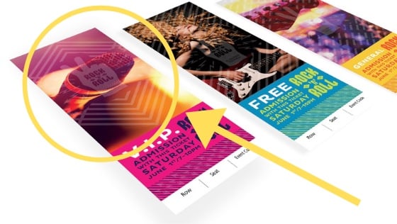
Various coatings can be added to printed products, such as spot UV coating, which applies shine to specific parts of a piece. A similar effect can be created by certain digital printers that can use clear ink. Because of the shine these methods add, a drastic contrast can be created when it’s used on matte stock. This is a great example of a technique that can add overall visual interest or emphasize specific spots of a piece.

White Ink
Printers often get stuck in the CYMK mold. Some digital printers allow you to utilize pure white ink. This can be laid as a base on colored stocks so that traditional colors show up like they’re supposed to and really pop. Or it can be used alone on dark stock to create an interesting black and white effect. White ink is not used very often so it’s a great way to stand out from the competition.

Embossing & Debossing
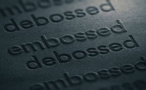
This is the method of pressing an image into your stock. Embossing creates a raised effect and debossing creates a recessed effect. Both are great ways to capitalize on the physical reaction people have when they hold a piece of paper because these embellishments add even more texture.

Foil Stamps & Digital Foil

These methods allow you to add a shiny, gold leaf effect on your print materials by literally bonding metallic foil to paper. This embellishment takes the effect that shinny coatings give and turns it up a notch! Gold is nothing if not eye-catching, which makes foil another great way to draw attention to specific parts of a piece, such as your logo.
Using print embellishments on your direct mail makes your pieces extra special, and therefore makes the recipient feel extra special. Most businesses would benefit from using these techniques, from colleges whose brochures run the risk of getting lost in a sea of higher ed marketing to non-profits trying to bring in more donations through appeal letters. Embellishments make it easy to send direct mail that looks timeless, fresh, and unique all at once!


Leave a Reply