
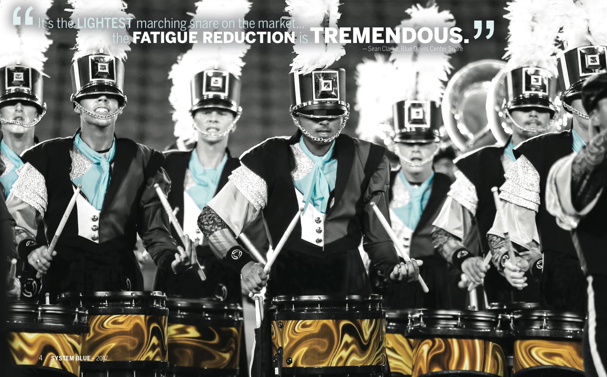
Marching with the famed Blue Devils Drum and Bugle Corps takes stamina, persistence, and discipline. Participants are often referred to as musician/athletes, because their roles within the group are so demanding on both levels.
The pageantry designers and educators behind the continued success of the 17-time world champion Blue Devils knew the drill. They lived it earlier in their careers and had long dreamed of designing instruments to support the rigors of marching by being lightweight, ergonomically correct, with superior sound and projection.

That dream became a reality several years ago when System Blue was launched. Jen Lowe, Marketing Director at System Blue, got involved with the company early on at the suggestion of a friend from the music business. “I had done a lot of music equipment branding over the years, but was thinking of going in a different direction,” she recalls. “Then I was introduced to System Blue and got excited about the opportunity to rebrand, create and be a part something remarkable.”
Branding & Design Come Together to Solidify the Vision
Enlisting the help of graphic designer and longtime project collaborator, Holly Fisher of Spence Creative, Lowe began the process of putting her brand vision to paper. “Holly’s the best graphic designer I’ve ever worked with,” Lowe proclaimed. The duo was very purposeful in their intent to create a warrior-like mystique around the performers.
Read now: Three Stakeholders with a Passion for Print
Following Lowe’s vision, the catalogue began with a black and white color scheme. Then, Fisher gradually introduced color as an accent to select images. “Our goal was to give the brand a superhuman, hipster, groovy edge,” she stated. “We wanted the marchers to be part of a brand that they own, and know they’re rock stars.”
Holly turned to SPC when it was time to print. The 2017 catalogue is a 48 page plus cover 10” x 8” oblong, perfect bound catalogue using 100# gloss text and 100# gloss cover. The cover is solid 4/color rich black with a silver foil stamped logo. The catalogues were introduced at the NAMM (National Association of Music Merchants) show in Anaheim, California. They were well received and sought after by attendees. According to Lowe, “People were stopping by the booth asking if they could buy a copy because they were so striking. We said, take one, they’re free!”
Awards & Accolades from the Printing Industry
The catalogue was also well received by the judges at the annual PINE (Print Industries of New England) Awards. SPC submitted the 2017 System Blue Catalogue to the PINE Awards of Excellence competition, where it garnered an award of recognition – Catalogue Division II – 4/Colors or more.
Brand building skills, edgy design, and high quality print merged to create not only a striking catalogue, but also a brand that accurately reflects the intense commitment to excellence of marching bands, drum corps, indoor groups, and the System Blue instrument design team.


Leave a Reply