
When you combine the talents of three stakeholders who have passions for print, the smell of ink on fine paper, and the tactile nature of printed material, wonderful things can happen. Such was the case when Tilton School embarked on an ambitious project to redesign their suite of admissions material.
 How the Process Began
It began with a spirited brainstorm session between Tilton School Admissions and Communications Directors and their longtime creative agency, Square Spot Design. Tilton wanted to create admissions material that would stand out and reflect their unique culture and values, so it had to be bold, powerful, and memorable.
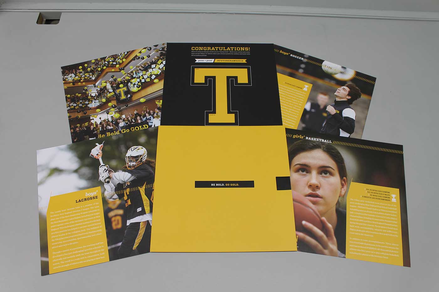
Admissions Director Kate Saunders envisioned the recipient having to “unbox” the printed material, revealing visual surprises that would hold the prospective student’s attention. Using that vision and the simple charge to include Tilton’s three “we believe” statements while keeping copy to a minimum, Square Spot took the idea and ran with it.
According to Square Spot Agency Principal Lisa Leidy, “We experienced incredible creative freedom with this project because of the trust that Tilton has in our instinct and talent. The result of that freedom was a final product that closely met their needs, yet surpassed their expectations. It’s rare to experience that freedom in our work.”
The Square Spot team stepped up to the challenge, creating a strategy that combined minimal copy, engaging design, bold colors, striking photography, and unique shapes to create multiple pieces that are visually captivating while successfully delivering the school’s message of value and differentiation.
What Made This Design Project Stand Out?
Inherent in the design and layout and key to its uniqueness was the use of different formats, paper sizes, and paper styles. The container piece consisted of a die-cut sleeve that held nine different 9” x 9” pullouts describing programming at the school and evoked a sense of curiosity that encouraged further exploration. The brand book complemented its unique design with different paper sizes and the mixed use of translucent paper on several pages. The base paper stock choice became extremely important because the nature of the project and the discerning tastes of the stakeholders demanded that the paper have an extreme “WOW” factor. After receiving a sample of Monadnock Astrolite, the designers made the case for stepping up to using this premium paper.
While all these processes and choices made for a first-class, effective suite of admissions material for Tilton, they presented unique challenges to the third stakeholder - SPC. The complex graphic design dictated that the printing crew remain vigilant in their pursuit of perfection. Multiple stitching functions, machine and hand assembly, page crossovers, hefty cover stock, and translucent paper were all components of the project that tested the mettle of the print production crew.
According to General Manager Jim Norman “Effective communication with Square Spot Design, as well as the high quality of everything they provided to SPC, including material specification, images, and file preparation made great project execution possible. We really appreciate the professional relationship we have with Square Spot Design.”
Bold vision, daring creativity, honed skills, earned trust, and a shared passion for print came together to make Tilton’s suite of admissions material more than beautiful brochures, but testaments to the dedication of the project stakeholders.


Leave a Reply