Color in Design- What Are You Really Saying?
In design, one of the most important details to think about is color. This may seem like a “duh!” claim, but there’s more to color than you may think; it’s not just about what looks the prettiest. Different colors promote different emotions and themes. Those promoted themes that colors bring can be hugely influential in your design, as can the emotional aspects.
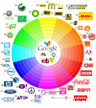
Try to think of your favorite brands. What colors do they use in their logos? Do you think those colors match the brand’s identity and what they stand for? Often, brands will use colors to improve their identity and perception to make themselves seem more appealing to their target demographics. BP Oil, for example, uses a green and yellow logo. Typically, green promotes and environmental theme and yellow promotes happiness. Of course, oil is not the most environmentally sound business, but their logo insinuates otherwise. This tactic can work, occasionally, but can also cause negative reactions among those who understand the use of color in design.
The chart below shows various logos and their colors. If you look, you will see that although many brands may share the same colors, they are very different in what they offer or represent.

Here is a list of colors, along with the emotions and themes they promote, and when they are used:
Red:
The color red promotes power, importance, and youth. Red is also said to make people hungry, so if you’re trying to lose a few pounds, maybe you shouldn’t paint your kitchen red. Instead, you could use red as an accent wall in your office to inspire you to be work hard during the day.
Orange:
The color orange promotes friendliness, energy, and uniqueness. A good time to use orange could be when designing children’s toys and other fun/happy products.
Yellow:
The color yellow promotes happiness, enthusiasm, and antiquity when darker shades are used. A proper way to use yellow in design could be for a family business logo, or, again, children’s products.
Green:
The color green promotes growth, stability, financial themes, and environmental themes. Green is a highly used color in the design world, often used by financial institutions and sustainability organizations.
Blue:
The color blue promotes calm, safety, openness when lighter shades are used, and reliability when darker shades are used. Blue is a great color to use in common rooms of homes, and even public places such as a hospital rooms.

Purple:
The color purple promotes luxury, romance when lighter shades are used, and mystery when darker shades are used. Purple is great for luxury brands, children’s products, and companies that target women.
Black:
The color black promotes power, edginess, and sophistication. Many upscale businesses use black for the websites and corporate signage. But, be careful with black, when used in excess it can be intimidating to its viewers.
White:
The color white promotes cleanliness, virtue, and simplicity. White is often used to create light in design, and, when using blank spaces, it directs viewers eyes to specific touch points.
Beige:
The color beige promotes the traits of its surrounding colors. The best way to use beige could be as an accent color to enhance the colors surrounding it.
Gray:
The color gray promotes neutrality, formality, and melancholy. In design, gray is often used to evoke emotions, or insinuate a sense of solidarity.

Now that you know how important color can be, take your new found knowledge and explore the brands around you. See what you can learn about a brand just by looking at their logo, their store's interior, or their website. Does their color choice match their brand identity? Keep these things in mind as you explore new brands and you could find that you have been choosing your favorite brands based on their colors all along. Oh, and don't foget: 1 in 12 of us is color blind!


Leave a Reply